Visualization Basics
This tutorial deals with visualization basics. We will start off by showing you different ways to create a scene and reference visualization objects after they had been created. Next, we will show you how you can rework your graphs by using labels, legends and modifying plot cubes.
Prerequisites
Make sure to have read the getting started guide of ILNumerics and to have set-up your project and code as recommended.
Some of the following examples make use of functionality from the Computing Engine. This relates to data creation, mainly. It is always recommended to know the basics of the Computing Engine, too.
Each chapter concludes with an interactive web component showing an example. This is where you can experiment with what you have learned. You can use the code of the component in your own project with minimal adoption. Learn more about interactive web components here.
Each chapter concludes with an interactive web component showing an example. This is where you can experiment with what you have learned. You can use the code of the component in your own project with minimal adoption. Learn more about interactive web components here.
Scene Creation
One of ILNumerics’ strengths is that there is usually more than one way to implement functionalities. However, in the beginning this can be quite confusing. Hence, let’s take a look at the three main methods that are used to set up a scene. In all of the following cases, a child node is assigned to a parent node twice.
In the code below the Add() method is used to assign PlotCube() to Scene() respectively LinePlot() to PlotCube().
Here, the property Children is used to assign child nodes to their parent nodes using a more compact notation (see: object initializers, C#, VB).
However, you can also omit the expression Children ...
... or just mix the methods displayed above.
All of the implementations above plot the same scene. In all cases desired visualization class objects are assigned to the scene. Inside the scene you may arrange those objects in a hierarchical order.
Referencing
In some cases you might want to make additional changes to an already exisiting visualization object. There are several ways to do so:
Like in the examples above, we began with creating and setting up a scene. This time we added two LinePlot() objects. For better distinction we assigned them to variables but also used tags. In line 7 we access the first LinePlot() object by using the method First<T>(), where T represents the node type to filter for. It will return the first object of the specified node type. To modify the second LinePLot() object, we can either use the same method and provide the corresponding tag or simply use the variable linePlot2.
Labels
Graphs are created to make results or complex data more accessible. For this purpose, we usually have to rework our graphs by adding legends or labels, in order to highlight what we feel is essential.
The following plots make use of labels in different ways:
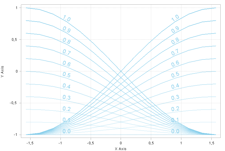

Let's take a closer look at the first plot. Here, each label is placed above a corresponding line. Furthermore, the orientation of the labels is adjusted to a specific slope. In the following we will walk through the steps in creating the right side of the first plot.
To begin with, we created a sequence of line plots. For this purpose we enclosed the command LinePlot() in a loop. In each step a new line plot with different positions and properties is added to a plot cube that was created before. To better distinguish the lines, the opacity of the line color increases every step.
Also, we included the creation of Label() objects in that very same loop. This way a corresponding label for each line plot is added to the plot cube.Just like the LinePlot() class Label() exhibits many properties that the user can customize. Here, we specified the font first, next we chose a font color that matches the color of the line plots. Since we want the labels to be aligned horizontally, we kept the horizontal position constant while adjusting the vertical position for each label. The corresponding y coordinate and a small offset yield the vertical position just above the curve. Finally, we adjusted the orientation of the label. For this we calculated the slope of the curve at the label position and assigned this value to the property rotation.
Putting all the pieces together, results in the following code and corresponding plot. A good exercise could be writing the code for the second plot from above.
Legends
Especially when it comes to graphs containing a lot of information, it is difficult to keep an overview. This is where legends come in handy. In ILNumerics you only have to add an Legend() object to the scene. This will automatically generate a legend containing all visualization objects of the scene starting with the first one that was added. If you want to add specific names, you can provide the Legend() object with a string as done in the code below. If specific names are not provided, the default tags of the visualization objects will be taken instead.
The following code displays how a new Legend() object is added to a plot cube. Since three line plots were added to the plot cube before, we provided the Legend() object with three strings.
If you only want specific visualization objects to appear in the legend, you can also add items manually to the legend as shown in the example below.
Here, only one legend item is created by providing a reference to an LinePlot() object. The indicated tag will also appear in the legend later, but can be modified if required. The second legend item is added by creating a new LegendItem() object and assigning it to the property Item. A visualization object must be provided to the LegendItem() object next to an optional name. It is very important to call the method Configure() afterwards, in order to make sure all legend items were created.
This allows you to reference them and perform individual actions later. For instance, in line 27 we changed the color of the second legend item, while we removed the first legend item in line 29.
In Visual Studio and all your applications utilizing the Visualization Engine user interaction is supported, which means that you can reposition the legend by dragging it with your mouse.
Plot Cube
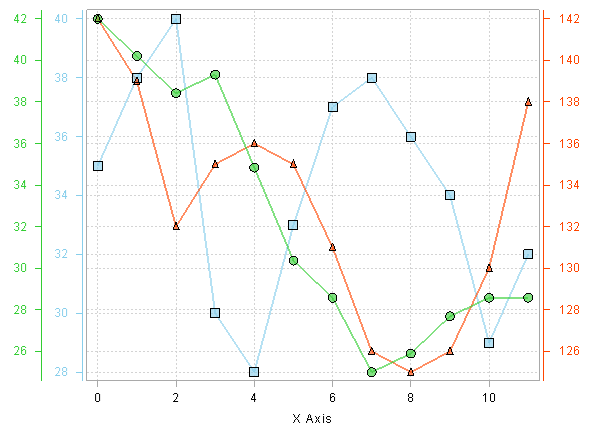
Next to labels and legends, you can modify the plot cube itself as presented below. On the left-hand side multiple plots that partly share axes are shown. On the right-hand side multiple data sets are depicted in one plot with multiple Y-axes.
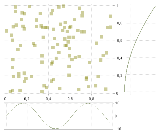
Let's examine the first graph more closely. Just like before we began with creating a plot cube, where the child node Points() was specified. Next, the property ScreenRect, the rectangular area of the plot cube on the panel, was set to (0, 0, 0.8f, 0.8f). As a result, the plot cube is placed in the left upper corner. The values (0, 0, 1, 1) correspond to the entire panel area available. Furthermore, axes properties were modified. First of all, all labels were set to invisible, since they would interfere with the other plots. The Y-axis was moved to the right of the plot cube.
In the next step, the second plot cube and a visualization object were created. Just like before, the rectangular area of the plot cube was increased and the Y-axis was moved to the right. All the labels and the ticks of the X-axiswere set to invisible. As a result, the X-Axis disappears, while the vertical lines are still there.
Finally, the third plot cube was created. The settings are quite similar to those of the second plot cube. However, the width and height of the rectangular area were inverted. This was necessary, since we wanted to rotate this plot cube by 270° but ensure that it aligned with the first plot cube.
The code below contains the last three code snippets and the resulting graph.
For the second graph, we only created one plot cube and added a LinePlot() object based on the first data set. Next to modifications of line properties, we decreased the rectangular area of the plot cube, moved the Y-axis slightly to the left and changed the color of the ticks and axis labels.
In the next step we created a DataGroup() object and added a LinePlot() containing the second data set. An DataGroup() object can be configured independently.
Subsequently, we created a second Y-axis for the second data set by providing the Axis() object with the DataGroup() object dataGroup2. Here, we also wanted to specify the axis properties to make sure the axis matches the corresponding line plot.
In the code below you can see that similar actions are performed on the third data set.
More
You can finde more detailed information on the topics above on the following pages:
The section of the online documentation dealing with plotting and charting objects contains another plotting quick start guide.